We have a tremendous sense of déjà vu. Our intuition is screaming that we’ve been to this rodeo before. You’ll be tempted to laugh, but we really don’t have a lot more to say than we have already told you in the last few editions of the Canso Market Observer. No, we are not tongue-tied but things are pretty much where we thought they would be at the end of 2014:
- The U.S. economy is improving and growing; and
- The equity and credit markets had a pretty good year; and
- Oil prices and the Canadian dollar declined; and
- “Quantitative Ease” ended.
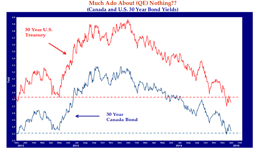
Much Ado about QE Nothing?
The real surprise in 2014 was that bond yields reversed all of their 2013 increase with an unexpected rally in bond prices. The market and your humble Canso correspondents are still watching and waiting for yields to “normalize” but the consensus is now abandoning the rising yields scenario and glomming onto the deflation camp, especially since oil and commodity prices are plunging.
In the chart above, we present the yield of the 30-year U.S. Treasury bond and its 30-year Canada bond cousin for the past two years ending December 31st, 2014. This shows that bond yields are now basically where they were on December 31st, 2012. At that time, the 30-year U.S. T-Bond had a yield of 2.95% and the 30-year Canada was 2.37%. One year later, the U.S. 30-year yield had risen to 3.97% and the 30-year Canada bond to 3.24%. On December 31st,, 2014, the U.S. 30-year T-Bond was 2.75% and the 30-year Canada was 2.34%. So, after rising about 1% in 2013, long bond yields have fallen back to about the same levels as December 31st, 2012.
That’s a lot of “To-ing and Fro-ing”, but as the French say: “Plus ça change, plus c’est la même chose”. Translated for those of our readers who do not read the other Official Language of Canada, it translates to the familiar saw: “the more things change, the more they stay the same.”
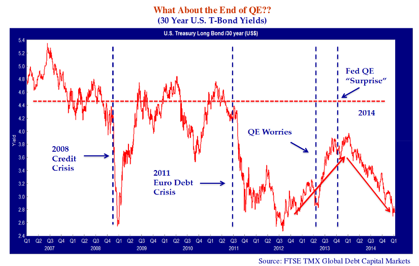
Setting Sun on QE Rising Yields?
In our January 2014 Market Observer, we had a chart entitled “Rising Yields for U.S. Long Treasury Bonds” which showed the 30-year U.S. T-Bond yield. We used this chart to explain why long bond yields had been rising for the last half of 2013. We have updated this chart below for 2014 which is shown as the blue shaded area. It shows pretty dramatically that, although yields rose when the market impounded the end of Quantitative Ease, investors soon got used to the idea and yields then fell dramatically in 2014.
The Big Quantitative Easy
So interest rates and yields are the same but has anything changed in the last two years? Recall that in 2012, we had just gone through the Credit Crisis and the Euro Debt Crisis was in full sway. Central banks around the world were under pressure to do something, anything, to stem the tide of financial disaster. They were “innovating” like crazy.
Mr. Draghi, the new President of the European Central Bank, had just confronted the market speculation on a breakdown of the Euro Zone monetary union. In his monetary “High Noon” moment, Draghi announced that he would do “whatever was necessary” to defend the Euro, including buying government bonds which effectively ended the Euro Debt Crisis.
Ben Bernanke and the Federal Reserve, for their part, were no slouches in innovation. They were well into “QE 3”, the third iteration of “Quantitative Ease”, the policy of printing money at the Fed to buy bonds from the Treasury. This iteration of QE saw the Fed buy Treasuries and Mortgage Backed Securities to the tune of initially $40 billion per month. Not content with that amount, the Fed raised the monthly purchasing to $85 billion in December 2012.
As we said earlier, the U.S. economy and the financial markets have recovered “somewhat” from their thrashing during the Credit Crisis meltdown, although yields have now returned to “emergency” levels. There is no doubt in our minds that the Credit Crisis was a searing experience for all involved. This extends to the highest levels of the U.S. financial bureaucracy.
The Great Immoderation
After years of “light touch” regulation inculcated by the efficient markets financial school, the high financial priesthood of Washington was shocked and terrified by the train-wreck markets during the Credit Crisis. Government was just supposed to get out of the way and let the markets be efficient. To those who came of professional age during Alan Greenspan’s “Great Moderation”, the raw fear and the out of control nature of the Credit Crisis terrified those used to having someone “in charge”.
Perhaps this period should be called the “Great Immoderation” since it has led to very immoderate policies by very stressed people. Tim Geithner, the former U.S. Secretary of Treasury, recounts in his book Stress Test his panic, if not terror, during the Credit Crisis. We have discussed in past newsletters the importance of understanding investor psychology for disciplined investment. John Coates talks about the “clinical state” of traders in his book Hour Between Dog and Wolf that we discussed in the July 2014 edition of this newsletter. Perhaps Geithner’s extensive contact with Wall Street channeled its intense pessimism to him.
We don’t know if QE was necessary or even worked to improve the economy. What we do know is that, at the very least, it had a placebo effect on panicked investors. The big question was what would happen when QE was ended.
Well, what actually happened was that the Fed announced in the spring of 2013 that it was reducing its QE purchases of bonds. The bond market then kicked up in yields in the summer and fall of 2013 as investors forecast a drop in demand for Treasuries.
Yields Didn’t Rise to the “End of QE” Bait
Then just to prove that markets always defy the experts, bond yields dropped back in 2014 to where they started before the “End of QE” hype. In a consensus fake out comparable to the Y2K fears in 1999, the end of QE did not mean rising yields. U.S. T-Bond yields are right back where they were when QE was going gangbusters.
Our readers know that we were always skeptical about the effects of QE. The “expert” policy makers were of the opinion that “something was better than nothing”. We believed that conventional monetary policy was already so loose that it was not clear that the innovative Quantitative Ease programs were working.
Academic economists will debate this issue for many years to come. Clearly, the fears that the end of QE would wreak financial pestilence on the markets and economy were not borne out. This would suggest to us that the impact of QE was perhaps less than its proponents claim
Is it Normal to Normalize?
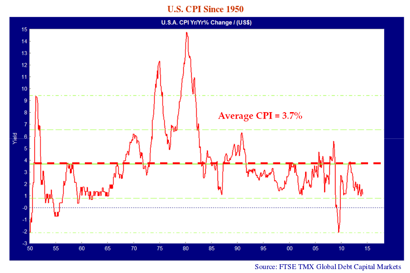
We are now at the same juncture that we were two years ago. At some point, the U.S. Federal Reserve must “normalize” interest rates. As we have explained, our research shows that historically, T-Bills run 2% above inflation and bonds 1-2% above T-Bills.
The graph above shows U.S. inflation since 1950, which has averaged 3.7%. Except for the middle of the Credit Crisis and 2008-09 Recession, inflation has stayed in positive territory. As the chart shows, inflation ranges between 0.7% and 6.6% for 66.7% of the time. Does this mean we cannot have inflation of -2%? No, but it is not likely based on history. At the current level of U.S. T-Bills, just above zero, either the market is forecasting inflation at -2%, or T-Bills are too low.
What Didn’t Go Up Won’t Necessarily Go Down
What of the fall in oil prices to under $50? Yes, this is a deflationary force but consider the opposite. Oil prices rose 460% from $25 in 1999 to $140 in 2008 and inflation averaged just 2.9% in the U.S over this period. When commodity prices skyrocketed during the commodity mania, inflation stayed well under control. Despite the deflation “sky is falling” hysteria by the Chicken Little School of economic commentary, why would we expect deflation to be passed through by falling prices when inflation was not passed through by rising prices?
Consumer Bonanza
Cue the theme from Bonanza, the 1960s western TV show. The really unexpected result might be a consumer spending boom in the U.S., as the drop in energy prices translates into more consumer spending. This is akin to a “supply side” tax reduction or a Keynesian stimulus program. The overall economic effect of the energy price drop will be positive, in our view. While employment and capital expenditure in the U.S. energy sector will fall, the boost to GDP from the far greater consumer share of GDP will be a significant economic portent.
The boost to consumer spending will not just be in the U.S. It will apply across most economies, both developed and developing, especially those that are significant importers of oil and other energy products. In an interesting reversal of fortune, this includes Ontario and Quebec.
Lights Out for Commodity Producers
The major commodity exporters will obviously be hurt. If you make your living selling your resources to foreigners and importing their goods and services, it might just be close to “lights out”. The pool of oil beneath Saudi Arabia is obviously worth a lot less. The Saudis, Iranians, Venezuelans, Russians and other oil exporters will have much less money from oil revenues to finance their extensive social programs.
We continue to think that Canada, China and Australia, the “economic stars” of the post Credit Crisis recovery, will find it heavy sledding. China unleashed the “Mother of All Credit Booms” to escape the global recession following the Credit Crisis. As we have discussed before, this was perhaps the biggest credit boom in
human history and perhaps the least discriminating.
We have gone into the details before, but it is suffice for our new readers to understand that the Chinese “Command and Control” economic system ordered its State banks to lend more, without considering why or what for. They obeyed orders and the result was spending mania that forced up the price of almost every commodity known to mankind. This is not likely to be repeated again. It now seems that even the “Dictatorship of the Proletariat” can learn some economic lessons:
“It’s not 2008 again,” Zhao Xijun, a finance professor with Renmin University of China in Beijing, said in reference to a 4 trillion yuan stimulus China unleashed at that time.“ When China launched the big stimulus package in 2008 to deal with the global financial crisis, China wanted nothing but faster growth; now China is focusing more on quality, efficiency and sustainability.” Source: Bloomberg January 6, 2015
The Chinese credit bubble created what we called the “commodity mania” in past newsletters. This benefitted commodity producers but the commodity cycle is a two edged sword. While the price appreciation thrills to the upside when fixed supply meets growing demand, the downside to prices from expanding supply meeting falling demand seems to be bottomless at the back end of the cycle.
It’s All About that (Manufacturing) Base
We are particularly worried about Canada. Things are shaping up poorly for 2015.
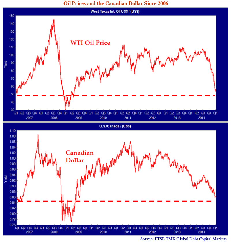
One of the most popular songs at the Canso Christmas Party, and we like to dance, was Meaghan Trainor’s “All about that Bass” featuring a driving bass line. We agree with Ms. Trainor that it is “all about the base”, the manufacturing base in this case. The problem for Canada is that our commodity and energy sectors drove up the Canadian dollar to levels that devastated the manufacturing base of central Canada.
Looking at the chart on the previous page, there is no doubt that this was the case as the Canadian dollar in US terms has tracked the price of oil very closely. The Canadian dollar was US $.86 at the start of 2007 when oil was US $50 a barrel. The Canadian dollar then rose to US $1.08 in 2007 when the price of oil went over US $100. At the end of 2014, the price of oil had fallen to US $50 and the Canadian dollar responded by falling to US $.86.
No Bringing the Manufacturing Booty Back
The Canadian dollar is still falling, as we expected, and we believe it will continue much lower. It will take some time for this Canadian dollar depreciation to pass through into expanded manufacturing. Unlike Ms. Trainor, who sings that she is “bringing Booty back”, we don’t think the Manufacturing Booty will be coming back any time soon.
All the Canadian manufacturing plants that shut down because of the high Canadian dollar will not likely ever return. A Canadian branch plant of an American company that shut down and is now only 10% of U.S. production will not be repatriated to Canada. The existing Canadian manufacturers that managed to survive the high Canadian dollar will prosper and likely expand in the next year or two. Think Bombardier and CAE. New export manufacturing operations will be created but this will likely take years.
A Pox on Our Own Houses
Perhaps the most troubling problem for Canada will be the eventual reversal of our residential housing mania. Yes, we Canadians all agree that our houses can never decline in price, but the facts on the ground are not good. Deutsche Bank just published a global housing market study and found Canadian housing prices to be some of the highest in the world, overpriced by 63% and Canadians to be some of the most indebted people in the world.
Markets and the consensus are very fickle. The trouble with housing as an investment, as the Americans have learned, is that prices of investments move up, which everyone likes, and down, which nobody likes. When prices are rising, the owner of a house can wait for prices to rise further to sell but buyers scramble to buy with fixed supply and bid up prices far above intrinsic value. When prices are falling, the exact opposite is the case. Owners perceive that it is better to sell quickly and buyers realize that time is on their side and wait for prices to fall further. This expands supply and contracts demand.
Many commentators made predictions that Canadian house prices would fall in 2011 and 2012. When house prices rose instead, most of the vocal housing bears decided that discretion was the better part of valour and went silent. At Canso, we know it is hard to time markets. Our profitable observation is that Canadian prices are far too high and that they have only become more overpriced. We do not know when prices will fall, but they ultimately will as the housing market momentum falls off. When the “Last Fool” has bought the last overpriced Condo, things will not be good.
From the Housing Ridiculous to the Absurd
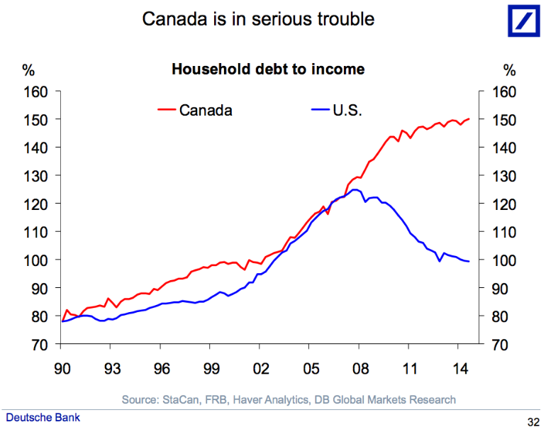
The problem for Canada is that we went from the ridiculous to the absurd in housing. The Financial Post reported on the Deutsche Bank findings in their article “Deutsche Bank reveals 7 reasons why ‘Canada is in serious trouble,’ starting with a 63% overvalued housing market”. A couple of the charts caught our attention, as they highlight things that we have been remarking on for some time. The chart on the next page “Canada is in serious trouble” shows the Canadian and U.S. Household debt to income ratio.
This shows how bad the problem really is. Canada and the U.S. both had household debt at 125% of household income in 2007, just before the Credit Crisis. This was up from 80% in the period 1990 to 2002. The Americans then went through their housing disaster and their ratio fell back to 100%. Canada, in the midst of a government insurance fueled housing mania, rose from 100% to 150%!
An eventual fall in housing prices will not be good for homeowners and government finance. The real problem will be the significant share that residential housing construction now makes up of the Canadian economy.
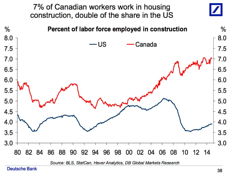
In the chart on the following page, Deutsche Bank charts the percentage of Canadian workers in housing construction in Canada and the U.S. This shows that both Canada and the U.S. had about 5% of their workers in housing construction in 2000. Canada typically had more of its workforce in housing construction in the 1980s and 1990s but this gap had closed by 2000. The similarity between Canada and the U.S. in housing employment makes sense, as our economies and societies are quite intertwined and move in similar cycles.
From 2000 to 2007, both Canada and the U.S. saw increases in housing employment. The U.S. moved from 4.5% to a peak of 5% of GDP in 2007 just before their housing bust. What is striking about this chart is that Canada moved from the same 5% of workers in residential construction as the U.S. in 2000 to a peak of 7% in 2008, a full 2% higher than the U.S.
Note that Canada fell from 7% at the peak in 2008 to 6.2% during the recession following the Credit Crisis. From this temporarily depressed level, compliments of crazed government mortgage insurance policies, Canadian housing construction employment then climbed back above 7% at the end of 2014. Canadians now have a historical peak of 3% more people working in residential construction than our American neighbours.
What this suggests to us is that the government backed mortgage insurance orgy might have created jobs during the recession but it now risks an employment bust of historical proportions. Letting banks lend with complete government backing is never a good idea as the Chinese are now finding out. If Canada drops from 7% of workers in residential construction to 3%, we will have a serious unemployment problem. Housing market analyst Ben Rabidoux of North Cove Advisors has pointed out in his reports that the actual employment in housing related occupations is much higher. All the bankers, mortgage brokers, real estate agents, appraisers and house stagers all adds up to something like 15% of total employment.
The news is not good on the housing front. Like in any market, the price increases on the way up are trumpeted loudly by those making the money. One reads of “prices surging” and “bidding wars”. On the way down, housing news vocabulary is much more muted. Prices “moderate” or become “affordable”.
Rabidoux points out in his latest report that Alberta had provided 70% of Canada’s recent employment growth. The headlines of layoffs in the Alberta oil patch are now affecting the Alberta housing market as seen by his comment on the Calgary housing market:
“It was only a matter of time before plunging oil prices caught up to Alberta’s housing market, but the preliminary resale data out of Calgary is even worse than I would have expected… Home sales in the city declined 7.5% y/y (the first y/y decline since 2010), but new listings surged 42% y/y to a record high for December, while active listings rose 45% y/y. That is a massive deterioration in the supply/demand balance in a single month.”
Like the Chinese, we don’t think another credit boom is in the cards for Canada. We have just gone through a residential housing mortgage mania of immense proportions that, like other financial manias, is not likely to be repeated for some time.
Markets Seeking Direction
What of the markets? They very much are seeking direction. We continue to believe that interest rate policy in the U.S. will be normalized some time “soon” through the eventual tight ening of conventional monetary policy. Janet Yellen and the monetary policy makers at the Federal Reserve really don’t want to but they will have to if the U.S. economy stays in reasonable shape.
At the start of 2015, we have seen a sell-off in equities and a drop in bond yields to below those during the Euro Debt crisis in 2012. We believe that most equities have followed downwards the devastation in energy and commodity stocks because of the huge investment following in market index ETFs. ETF investors and ETF sponsors tend to use index derivatives to hedge their exposures. This leads to all stocks tending to move similarly.
We have noticed, in early January, that stocks seem to be taking a bit of a breather and are rallying. The credit markets have been rather well behaved, out side of high yield and bank loans which are chock a block with oil and gas issuers. We continue to avoid the high yield bonds and bank loans of levered energy companies. Canadian energy companies represent ~35% of all outstanding high yield bonds in Canada. Energy bonds could suffer a higher incidence of defaults resulting in a further sell off in high yield.
It is still likely that risk assets will avoid a general sell off until and if monetary policy is tightened. This does not mean that we are not preparing ourselves for what lays ahead. Luckily, our value discipline directs us towards value, and right now we are finding it in higher quality securities.
Bond Testing
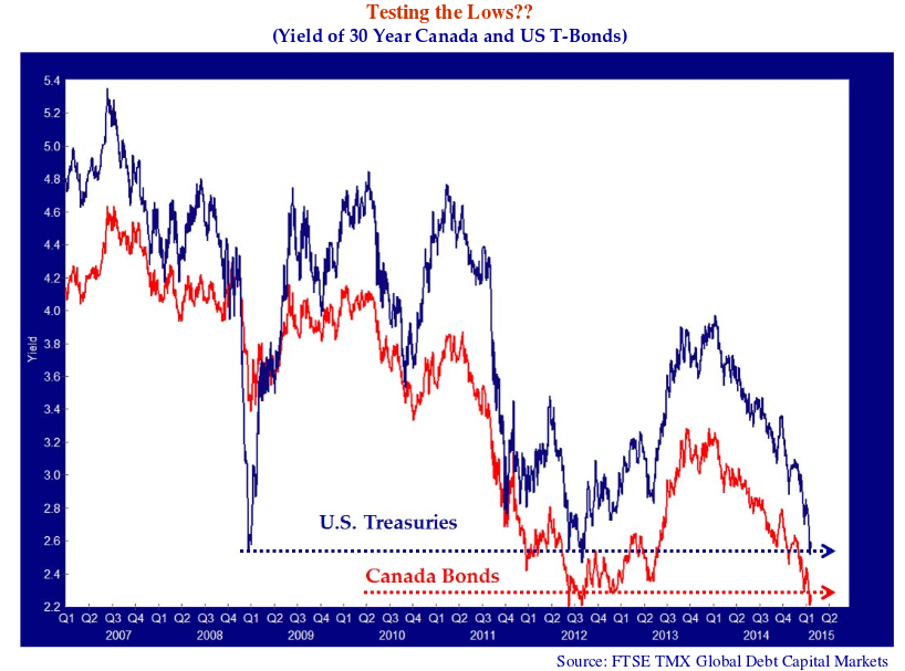
In terms of the bond market and portfolio term, we think that the bond market is testing the previous lows in yields established in this market cycle.
At the time of writing on January 8th, 2015, long bonds had rallied into year end and the first week of January, as stocks faltered and oil plunged below $50.
The yield on the 30 year U.S. T-Bond had fallen to 2.59% which was just above the low on June 12th, 2012 during the Euro Debt Crisis of 2.54% and December 18th, 2008 during the Credit Crisis of 2.55%.
Interestingly, the yield on the 30-year Canada bond on January 8th, 2015 was 2.28%. This was higher than the low yield of 2.20% on June 1st, 2012 during Euro Debt Crisis but much lower than the 3.39% low yield recorded on December 29th, 2008 during the worst of the Credit Crisis.
How Low Can We Go?
Will yields fall from here? Only if we are entering a desperate depression. We believe that we are experiencing our generational version of deflation, but things are nothing like the Depression of the 1930s when deflation was running -4% and unemployment pervasive at over 30% by some measures.
Right now, oil prices are falling but the U.S. economy is in reasonable shape at present. Unemployment rates in the U.S. are reaching lows not seen for some time. The housing market and the financial markets are recovered or recovering from their Credit Crisis shellacking. U.S. inflation is now at 1.5%.
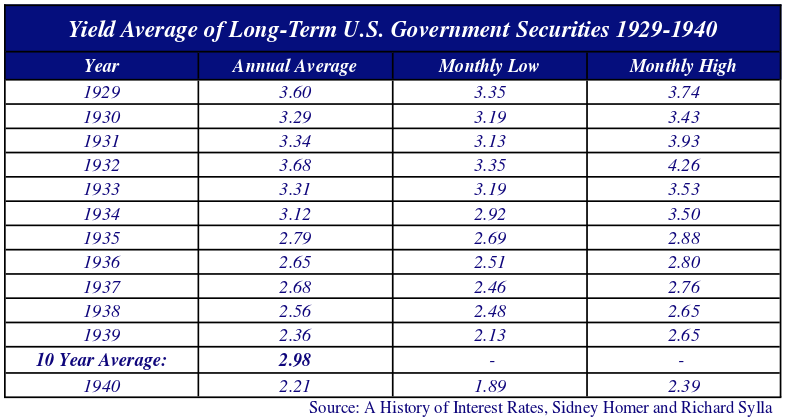
Most economic commentators and strategists emote from their personal experience. Just to make sure that we are free of our personal and generational bias, we got our favourite bond tome, “A History of Interest Rates” by the late Sidney Homer from the Canso library. It confirms our suspicion that long U.S. Treasuries had much higher yields during the 1930s Depression than the current levels.
Inspecting the table above, we see that long-term U.S. government securities averaged 2.98% from 1930 to 1939 during the Great Depression. The monthly low for the whole period was 2.13% in 1939 and the following year of 1940 was 1.89%. The 30-year U.S. T-Bond yield on January 8th, 2015 was 2.59%. This is near the yearly average for 1939 of 2.36% for long U.S. T-Bonds and below the average of 2.98% for the decade of the 1930s.
“Life she’s tough, and then she’s over”, as the solid Newfoundlanders say. On the other hand, what we are going through now has no economic or societal comparison to the deflation, unemployment, political and economic crisis of the 1930’s.
Betting that yields should stay this low is not something we think is prudent.
