Please excuse us for our lack of enthusiasm for the job at hand. We continue to watch and wait for the inevitable “normalization” of monetary policy in the United States. This is turning into something akin to watching grass grow or watching paint dry without the aid of time-lapse photography.
The veritable “trillion-dollar question” of our financial time is how and when monetary policy will be “normalized”. Central Banks around the world who pumped massive sums of money into their banking systems in the aftermath of the Credit Crisis are now pondering how to reverse their “emergency policy”.
Noooooooooobody! Wants Higher Yields
Now is the time to move from financial crisis battle stations to economic peacetime. The problem is that nobody, or as the Bad Boy commercial shouts, Nooooooobody! now wants monetary policy to be normalized. The capitalist citizenry of the developed world, no matter how right wing in their politics, are enjoying the benefits of cheap money: low borrowing interest rates, higher house and stock prices. Politicians know this and want their central bankers to “err on the side of caution”. Read this as printing money until the cows come home or the politicians are reelected.
The financial chattering class is especially unreliable in this matter, as it has a huge bias in favour of more money sloshing about. If your business is taking a little bit of all the money passing you by, you will likely be in favour of more money in circulation than less. Despite this, we all know in our heart of hearts that monetary policy will inevitably be normalized but we still don’t want it to be.
Modern central banking has taken on the essentials of an organized religion: mystery, power and faith. Like any religion, it remains the duty of the high priesthood to divine the future. How we can expect the central banking priesthood to divine the economic future when they have failed so obviously in divining the economic present is an interesting study in human psychology. It has to do with the innate and very human desire to believe. It also reflects our need to reduce the uncertainty about the future.
Not Yellen, But Messing with the Messaging!
Janet Yellen is now the Chair of the Federal Reserve, the highest Priestess at the Highest Temple of monetary policy. It falls to her to communicate with her faithful financial parishioners. They are presently examining her every vocal entrail in the hope of gleaning some portent of the future. The problem is that Ms. Yellen really has no idea what to do. She compensates for this by prevaricating about what is going on in the economy and iterating the possible Fed policies ahead.
To us Ms. Yellen seems to be “messing with the messaging” more than outlining Fed policy. Is the economy strong or weak? Is unemployment high or low? According to Ms. Yellen, becoming quite accustomed to the economic doublespeak of her predecessors, it depends! All we know from the Fed is that they are “data dependent”. This translates into waiting until the last possible moment to be forced into action when things have so obviously moved that there is no choice.
An Inconvenient Truth
We are well past the worst of the Credit Crisis and even the Euro debt crisis is a fading memory. Some bankers now suggest that they were not in need of rescue. This is rather convenient memory. If you are arguing that your bonus or dividend should go up, it is a convenient truth to claim historical financial perspicuity. The “inconvenient truth” is that there are very few banks globally that would have survived the Credit Crisis without the massive government support of the global banking system.
Was all of the crisis financial and monetary policy necessary? Much of it was, but much of it probably wasn’t and we will never know for sure. The policy response to the Credit Crisis gave rise to many “Emergency” and “Extraordinary” fiscal and monetary policy measures, some of which are still in place today.
Did QE Actually Lower Bond Yields?
The Bernanke Federal Reserve’s “Quantitative Easing” or “QE” is a case in point. This “innovative” monetary policy saw the Federal Reserve print money to buy more treasury bonds than the U.S. government was issuing with the explicit objective of lowering long term bond yields. The proponents of the policies say that these policies worked since things improved after they were implemented. On the other hand, when QE was ended, the market feared bond yields would rise sharply, as QE was meant to lower long-term yields. Quite the opposite occurred. After rising sharply in the last half of 2013 due to these fears, U.S. government bond yields actually fell sharply in 2014. If the end of QE did not see higher yields, we ask, did the QE program actually lower yields?
It is hard to separate out all the “emergency” policy. Whether QE was effective in the U.S. is moot, as it is now over and done with. There is no doubt that the Federal Reserve has created a lot of money since 2008 to anchor U.S. short-term interest rates at zero. At the time, the question was what would all that liquidity do?
Inflationista Fashion
The resounding answer at the time in 2010 was that there would be an inflationary spiral of immense proportions. You probably find it hard to believe this, since it seems so passé given the current financial terror at the prospect of deflation. Humans tend to remember things selectively to preserve their ego and you probably aren’t different. Given the current reality, your convenient memory might suggest that you had discounted the prospect of high inflation and leaned towards deflation. The reality was much different. The Republicans in the U.S. Congress were inflaming the financial media with talk of an inflationary spiral. The gold bugs were out in force and the commodity mania had taken hold. We did not agree with this Inflationista fashion. As we said in September 2010:
“A strong consensus developed in the first half of 2010 that interest rates would rise. This consensus was near universal. It was shared by professional and retail investors, financial pundits, and with all important confirmation by taxi drivers…
The consensus rationale was essentially that all the money that governments printed to defeat the credit crisis would end up in the real economy and thus create consumer price inflation…
While we are not fans of lax monetary policy, we did not subscribe to the “buy gold” inflationist hysteria. Call us naïve but we felt paper money had at least another quarter or two to go before it lost its entire value as a medium of exchange.”
Canso, Canso Quite Contrary
This was a very contrarian view at the time, as is our present belief that interest rates will eventually rise to more normal levels. Our view in 2010 developed from our observation that regulators in the U.S. were leaning hard on their banks to decrease leverage. We believed that this meant it would be very hard to have goods inflation in a period of debt deleveraging. All that cash created by the central banks was being used to shore up the balance sheets of commercial banks rather than in consumer spending.
This is why the Consumer Price Inflation was rather tame compared to the expectations of runaway inflation. Since banks were being required to hold large amounts of government bonds, banks bid up the price of bonds and that caused bond yields to decline rather than rise as the 2010 consensus had expected. The Euro Debt Crisis and eventual QE by the Fed sent bond yields plunging to generational lows.
“Getting Some” Financially
This drop in bond market yields and the discount rate used to value investments led to increasing financial asset prices instead of goods prices. There was massive inflation in financial asset prices that, with the help of the massive Chinese credit boom, extended to every investable commodity known to mankind. Gold, silver, copper, wheat and oil soared with Chinese “supply security” buying and investor demand for “inflation sensitive assets”. It didn’t reach Dutch tulip bulbs, as in the credit bubble of 1637, but it did extend to BitCoin, the virtual currency. Nobody quite knew who created Bitcoins or exactly how they worked, but in a mania, who really cares about the details since everyone is trying to “get some” financially.
Now we are at the opposite juncture in the Inflationista/Deflationista sparring match. The serious (consensus) investment thinkers are firmly convinced that deflation is inevitable and it very well could be. On the other hand, our experience and reading of investment history suggests that such a popular investment notion usually has little chance of becoming reality.
Euro Zoning Out
The proponents of deflation point to Europe and the negative yields on German government Bunds denominated in Euros. This, they say, is the future of our investment age and a predictor of global deflation. Once again, we beg to differ with the consensus. Just as the Inflationistas were fashionably wrong in 2010, we think the Deflationistas could very well be wrong in 2015.
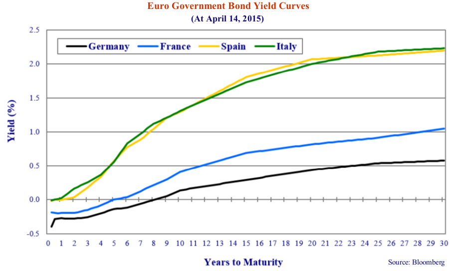
In the Yield Curve chart below, we show the yields of various Euro zone government bonds at the time of writing in April 2015. This indeed demonstrates that nominal yields are now negative on German government bonds out to 7 years in term. French government bond yields are negative out to 4 years in term. The question is why these yields are negative.
Herr Rippoff on Negative Yields
It is actually very hard to get negative nominal bond yields. Let’s think about how this works. Being a good German saver, I walk into my bank to buy a bond since Europeans and Germans in particular tend to buy bonds instead of investing in GICs. I have some money to invest and I ask about the bonds on offer. They tell me to go and see my “Financial Advisor”, Herr Rippoff, at the local Gasthaus.
Herr Rippoff tells me that if I give him 100.49 Euros, he will sell me a bond that matures in 2 years at 100 Euros. I ask what the interest rate paid on this bond will be. He tells me nothing will be paid since the coupon will be zero percent. “Mein Gott”, I say, “I will get back less than I invested. You want me to give you 100.49 of my hard earned Euros and get back only 100.00 in 2 years?”
Herr Rippoff ignores my approbation. “Mein Herr Canso”, he says, “This is modern European finance. You are very lucky to be paid this very attractive -.254% bond yield. You must get with the times and learn to accept getting back less money than you paid for your bond.”
I tell him that I would rather just leave my money in my bank account. He then tells me that I must leave one arm and one leg with him to pay my “deposit charges”. I then tell him to “stuffen” himself and that I will leave the Euros in cash under my mattress or in my safe at home. I then ceremoniously pour my very good German lager over Herr Rippoff’s head and exit the Gasthaus in a very impressive Germanic huff.
The Fantastik World of Germanic Bonds
Our more expert readers have no doubt been considering that we are not taking into account the coupon of the bond. Yes, if there was a coupon, especially a high coupon, we just might want to buy a bond for higher than its par value of 100 Euros. We do this all the time at Canso. The higher coupon creates a price at acquisition well above par that descends to par at maturity.
This is not now the case in the fantastik world of the current German bond market. The current benchmark 2 year and 5 year bonds have a coupon of zero as the table below shows:
Why would anyone in his or her right mind buy a bond that has a negative yield, or pays me negative interest? There are a couple of reasons that this might happen.
The first reason could be that there is deflation and the price of consumer goods is falling. This is rational. If the consumer price level is falling faster than the value of our bond investment then the value of my bond is increasing relative to the cost of consumer goods.
The second reason is the “Greater Fool Theory”. This postulates that one reason for an investment “Fool” to buy a ridiculously priced investment is that he believes there is a “Greater Fool” who will pay even more for it. So although we know our bond will fall from its present 100.49 Euros in price to 100 Euros at maturity, we know there is a “Greater Fool” who will buy our bond for even more than we have paid for it. This is not rational, but is the current situation in Europe.
The Greater Central Bank Fool
The good German savers aren’t the Greater Fools buying bonds with negative yields from Herr Rippoff. An individual investor might take a punt on an overpriced stock but it is highly unlikely he would lock in a certain loss with a negative yield. The “Greater Fool” is none other than the European Central Bank (ECB). Mr. Draghi, the President of the ECB, stared down the bond market during the Euro Debt Crisis and he has now launched “Quantitative Easing” to shock the economic heart back to beating strongly. This means that Mr. Draghi is buying a lot of European government bonds.
If you are a German banker like Herr Rippoff, you don’t have to worry that you are paying 100.44 for a bond and will take a loss when you get 100 Euros at maturity in two years. The ECB has announced its bond buying ways to the world at large and you know that the ECB will bid up the price of your bond until the specter of deflation is vanquished.
So, are the Deflationistas right about negative European yields presaging global deflation? Well, anything is possible but we think not. As we have said many times in our past newsletters, if a central bank prints enough money, then there will most certainly be inflation as Zimbabwe proved by debauching its currency out of existence. Argentina, Iran and Venezuela are now proving this once again.
On Velocities and Fractions
Whether increased money supply causes inflation is really a discussion of the “velocity of money”. A primer on money creation is in order. We all remember from Economics 101 that a commercial bank can create money in a fractional banking system. Someone deposits $100 and the bank must keep 10% or $10 in reserves so it can lend $90. This $90 becomes a loan to someone else who deposits it in a bank account. Then the bank can lend $81 of the deposit and so on.
This is called the “money multiplier effect”. That means that when a central bank deposits funds in a commercial bank that these can be loaned out. What happens if no one wants to borrow? This is Keynes’s “Liquidity Trap” where monetary policy is “pushing on a string “.
We believe that commercial banks were circumscribed in their ability to create more money by the capital demands of financial regulators. When regulators demanded more capital and liquid assets, then their banks invested the cash deposited by central banks in government bonds instead of loaning it out. This monetary stimulus improved the balance sheets of the banks but did not result in business and consumer loans that stimulated economic activity. Even “Quantitative Easing”, the purchase of government bonds by central banks, didn’t help. The central banks created the money to buy government bonds but then the investors took the proceeds and bought other bonds. This drove down bond market yields but didn’t result in much more consumer activity.
“The Facts, Nothing But the Facts”
With the headlines trumpeting DEFLATION and NEGATIVE YIELDS, we think that “graphing the data”, as always, is a good idea. As Detective Sergeant Joe Friday used to say in Dragnet on the mean streets of Los Angeles, “The facts, Mam, Nothing but the facts.” We took a look at yields in Europe because that is where the Deflationistas are currently holding sway.
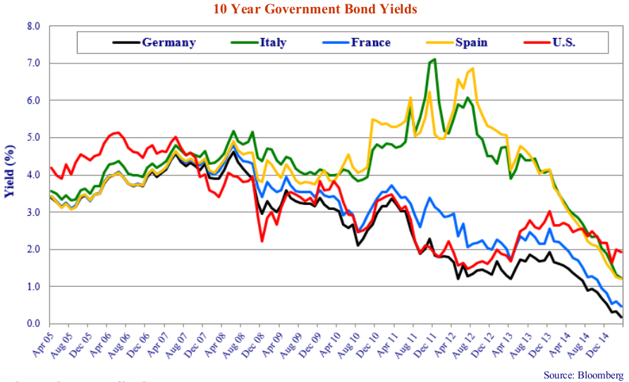
The chart on the following page shows 10-year government bond yields in the U.S., Germany, Italy, France and Spain over the 10 years from April 2005 to April 2015. What was quite interesting to us was that U.S. bond market yields were higher than those in Germany, Italy, France and Spain from 2005 to early 2008. Even more interesting is that weak Spain and Italy had yields quite close to those in stronger France and Germany. This all changed in the Credit Crisis when U.S. yields dropped below those in Europe. The effect of the Euro Debt Crisis is obvious in early 2010, when the yields on Italy and Spain soared while those in France and Germany fell in line with the U.S. U.S. bond market yields began to rise above German yields in 2012 and are now higher than those in France, Italy and Spain as well.
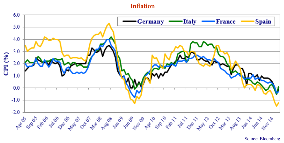
What About Inflation? The interesting thing about Europe is that in the Euro currency union, sovereign countries have ceded their ability to run an independent monetary policy to the ECB. Since the primary goal of any central bank is to maintain a stable price level, it is instructive to look at this. On the chart below we show inflation for Germany, France, Italy and Spain. Like in Canada, different regions experience different inflation based on local factors. Note that from 2005 to 2008, inflation ran much higher in booming Spain than slower Germany, France and Italy. This was the Spanish real estate boom, where cheap capital from the core Euro area banks was recycled into real estate projects on the sunny Spanish Riviera. Before the Credit Crisis, no one could imagine banks defaulting let alone countries.
Not Sunny on the Spanish Riviera
All the inflation rates went negative in the global recession after the Credit Crisis but soon recovered with Spain once again leading the pack with strong competition from Italy at both above 3% in early 2013. Now things are quite reversed with Spain quite negative and the other Euro countries hovering around zero.
This makes it interesting for a Spanish investor who could buy a very safe German government 10-year bond at .2% and have a “real yield” (yield minus inflation) of +1.5% (.2% – (-1.3%)). He could do even better assuming credit risk and buying a Spanish 10-year government at 1.3% and getting a real yield of 2.6% (1.3% -(-1.3%).
Aha, you say. Central banks like to tinker with the economy. What’s the point of having a lever to pull if you don’t ever pull it? Well we agree that central banks like to try to encourage economic growth and employment so it is also good to see what the ECB is up to in this area.
Shifting Unemployment
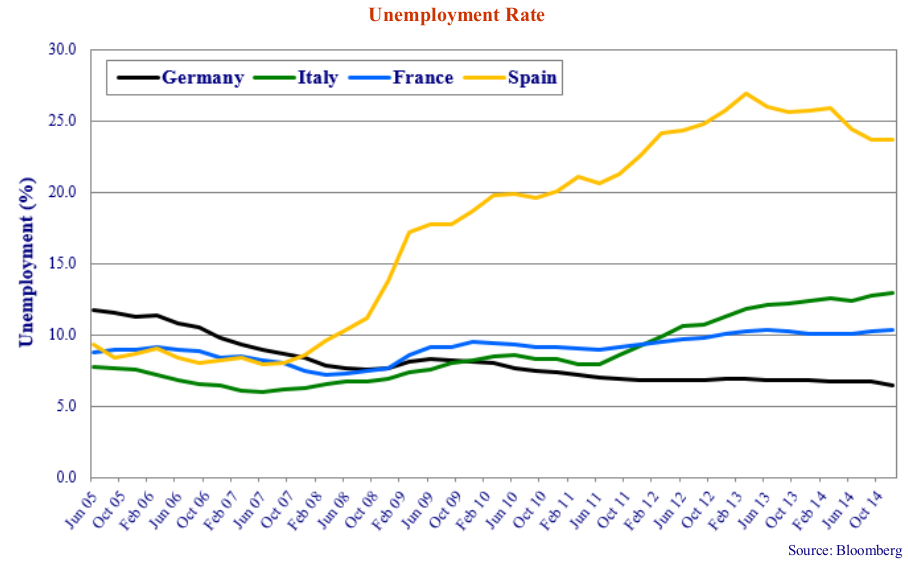
The chart above shows unemployment in our four Euro economies since 2005. Once again, looking at the actual data brings an interesting perspective. Who remembers that Germany had 12% unemployment in 2005, compared to Spain and France at 9% and industrious Italy at just over 7%?
Spanish unemployment started higher in early 2008, presaging the economic weakness brought on by the Credit Crisis. Perhaps the German banks that had stuffed themselves full of U.S. sub-prime mortgages were already pulling in their Spanish lending. Germany on the other hand has seen its unemployment drop from 12% before the Credit Crisis to the current 6%. Even the Euro Debt Crisis didn’t affect German employment as it has been quite stable since 2011.
The Spanish unemployment rate has gone from 9%(3% under the German unemployment of 12%) in 2005 to 24% unemployment(18% over the current German level of 6%). No wonder the Germans want to vote the Greeks and other “Peripherals” off the Euro Survivor Island. They have never had it so good. The Spanish, Italians and French must be wondering about the benefits of low interest rates as their unemployment rates are very stubbornly high.
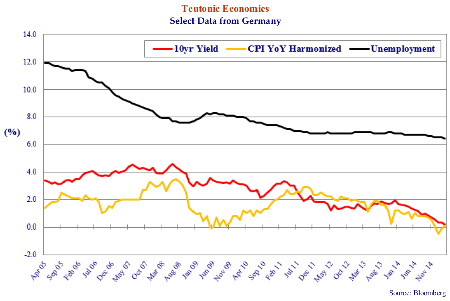
So a close look at the Germans is in order. In the graph above, we show the German government 10-yield yield, the German unemployment rate and inflation. This shows very low interest rates and inflation in Germany is not really doing much for the German unemployment rate. Note the strong recovery in the German CPI in 2009 from 0% to above 2% in 2011.
Now that we have looked at the European experience with low and negative yields, what conclusions can we draw? Is this our future? Will we all be dealing with negative yields the rest of our lives? We doubt it. The Spanish burst their real estate bubble and are now dealing with 24% unemployment. If low bond yields are the elixir that cures an ailing economy, Spain sure isn’t the poster child.
Well, we know that if you print enough money you get inflation, no matter what economic growth there is. The world central banks seem to want to err in favour of inflation in a major way, so that is something that actually might happen.
Longing for Historical Yields
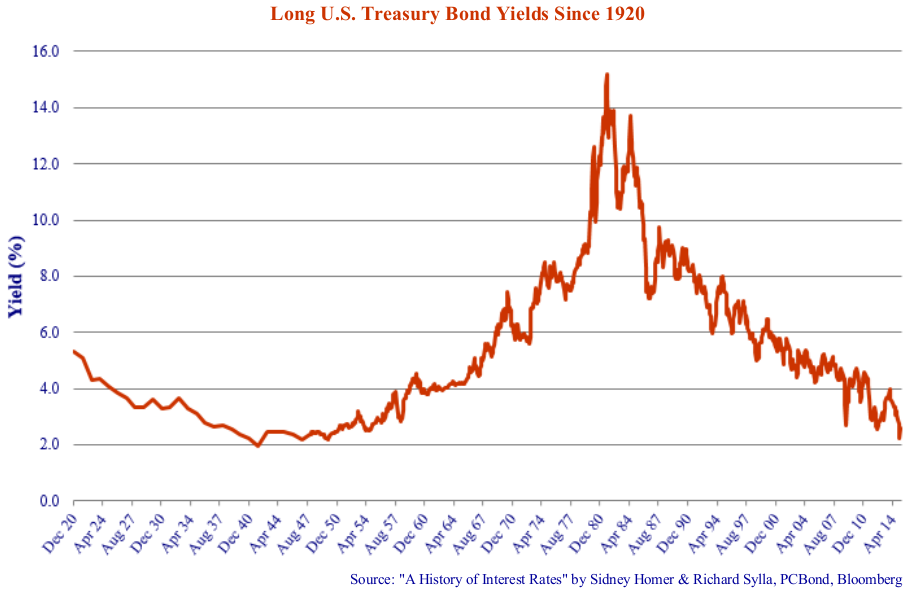
The historical record certainly doesn’t support the current negative yield frenzy. In the chart above we have graphed the long U.S. Treasury Bond yields since 1900. We have used the annual data from A History of Interest Rates by Homer and Sylla and combined them with our more modern data from PC Bond.
This shows that Long T-Bond yields bottomed at 1.9% in 1940. This was after a decade of very high U.S. unemployment in the Great Depression of the 1930s, at the current Spanish level in the 20-30% area, and deflation running at -2%. This gave an investor real yields in the area of 4%.
The Spirit of Bubbles Past
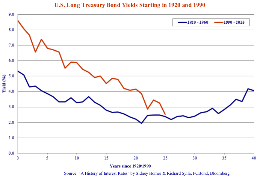
What Spain is now going through is a debt deflation after a credit bubble as was the case in the U.S. in the 1930s. We don’t know why, perhaps the “Spirit of Bubbles Past” guided us, and we decided to plot the Long T-Bond yields from 1920 to 1960 to see what this period looked like. This is shown in the chart on the next page as the blue line.
Our rationale was that the decade of the “Roaring Twenties” saw a strong credit expansion, financial boom and speculative stock market. We then wanted to see what happened to long T-Bond yields after the stock market crash in 1929 and into the 1930s. Perhaps still guided by mysterious powers beyond our comprehension, we then plotted 1990 to present as the red line on the same graph with the years counting up from the start date of 1920/1990 i.e. “10 years” the horizontal axis is 1930 and 2000.
A Message from the Bond Afterlife?
It was a bit eerie for us, delving into the bond afterlife. The similarity between the two lines certainly provokes thought. In 1920 the First World War had just ended and the Cold War had just ended in 1990. Both periods saw a “Peace Dividend” with the huge societal spending on military effort diverted into civilian endeavor resulting in much prosperity. There was also a large expansion of global trade and finance in both periods.
The parallels between the periods in the chart below struck us interesting and perhaps prescient. The 1929 stock market crash ended the “Roaring Twenties” and the end of the millennium in 2000 saw the “dot.com” stock market crash. What we hadn’t realized was the drop in long U.S. T-Bond yields from 1920 to 1928 that parallels the drop in yields in the 1990s. Very interestingly, yields then stayed flat from 1928 to 1935 even though the world was in a severe economic depression. Yields then head quite a bit lower from 1935 to 1941 in the darkest days of the Great Depression before the U.S. entry into the Second World War. The aftermath of the 1990s dot.com boom saw a drop in yields that created an even bigger credit bubble that ended in the Credit Crisis. Despite this, the long T-Bond yields tracked very similarly.
Are We Being Paid to Take Interest Rate Risk?
What this chart seems to suggest is that it takes a long time to work an economy out of a financial crisis. A little caution is warranted in simplistic parallels, although we couldn’t resist doing exactly this. The situation is much less dire today than in the 1930s. The Depression of the 1930s saw unemployment well above 20% and persistent deflation at -2% to -4%. Even with this economic stress, bond yields still did not go significantly below 2% for any protracted period.
For those predicting ultra low interest rates forever, we note with some caution that, as we show above, Spain is currently experiencing its own Great Depression with unemployment of 24% and inflation at -2%. Contrary to the Deflationista and negative yield hysteria, Spain still has 10-year government bond yields at a positive 1.3%.
We still think it is highly unlikely that yields have much farther to fall. If monetary policy is normalized, then yields will likely rise. Is this a bad thing? If there is anyone out there who needs to borrow and hasn’t already, we really don’t think a slight increase in interest rates will be a determining factor. On the contrary, since demographics are aging in Western developed economies, it just might be that rising interest income will benefit spending more than it hurts borrowers.
“Poloz-a-Looza”
In a pique worthy of comment, The Canso Editorial Review Board, aka “The Peanut Gallery”, complained that the first draft of this scintillating Market Observer was bereft of any Canadian content. Despite our nagging objection against editorial interference by preening Weenies and our innate desire for artistic freedom, we decided to accommodate a Canadian perspective.
To your humble correspondents, it is clear that Canada’s economic destiny is currently tied very closely to the policy of the U.S. Federal Reserve. Yes, Mr. Poloz, the Governor of the Bank of Canada (BOC), very forcefully declared his monetary independence with his “Insurance” surprise rate cut in January. This did not end very well on the currency front, as the Canadian dollar plunged against the U.S. in record fashion. We think this “Poloz-a-Looza” insurance policy ended very badly and actually risks a currency crisis if repeated.
“Shock and OUCH!”
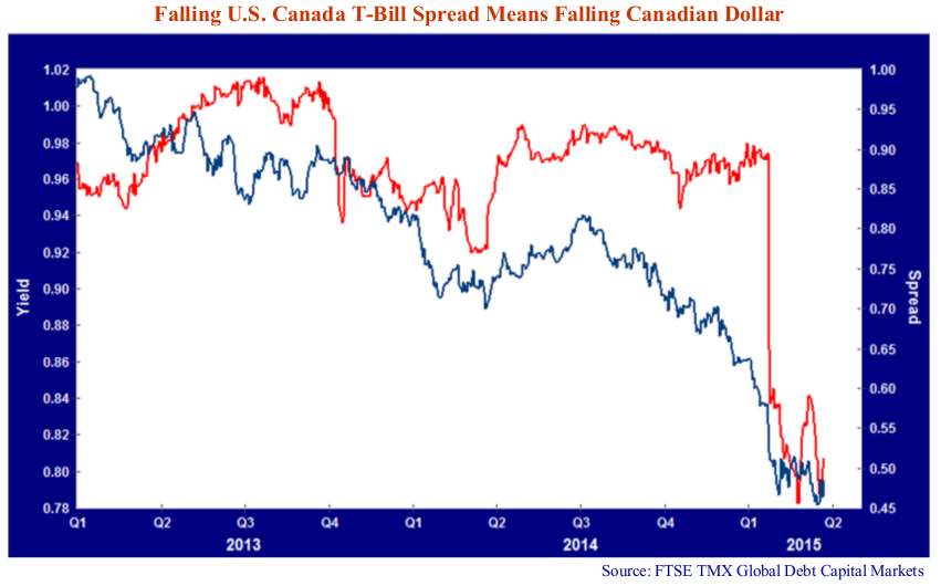
A look at the chart below shows why we are very worried about a further rate cut by Mr. Poloz. Canada is a small open economy and our monetary policy by necessity has to follow the U.S. if we want to avoid major currency shocks. The red line in the chart is the spread between the 90-day U.S. and Canadian T-Bill yields. This subtracts the U.S. T-Bill from the Canadian.
Mr. Poloz sure surprised people. It was more “Shock and Ouch” than awe. Note that the Canadian dollar in U.S. terms, the blue line, had been hovering in the $.90 U.S. range until the market quite rightly decided the Mr. Poloz wanted to be the master in his own currency house in late 2014 and early January 2015. The fall from $.90 U.S. to below $.80 was one of the major Canadian dollar currency moves that we have found historically.
The “Shock” of the BOC rate cut became a very painful “Ouch” for any Canadian who pays for things in U.S. dollars. Since most things that Canadians buy: oil; wheat; coal; electricity; TV shows; Movies; electronics and even video downloads are effectively priced in the U.S. since we have a very closely integrated economy. It is no fluke that Apple raised its prices in Canada recently.
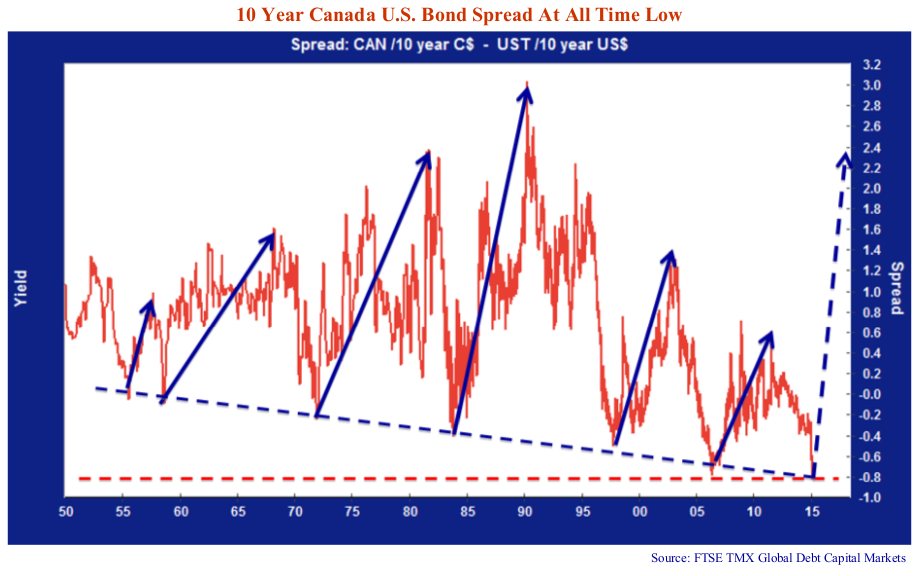
We believe that Mr. Poloz and the Bank of Canada were very surprised at the market reaction. They also now understand that their latitude to have a differential monetary policy is quite constrained. Canada usually lags the U.S. in a tightening cycle when the economy and commodity prices are strong. This usually coincides with Canadian bond yields falling below those in the U.S. as foreigners rush into Canadian denominated financial assets. This can be seen in the chart below that shows how the Canadian/ U.S. government bond spread goes negative and then whiplashes with a vengeance to very, very positive spreads. Note that the periods of low or negative bond spreads coincide with periods of commodity strength: 1973, 1984, 1997 and 2006. The current spread is at the record low and negative spread.
As we’ve said before, if U.S. bond yields don’t change and Canada goes back to normal levels, we could very well see Canadian yield rise by 1% to 3%. It is also useful to note the price violence of the movement in the Canada/ U.S. bond spread. From 1984 at a -.4% spread to +3% in 1991, a ten year Canada bond depreciated in price over 20% versus a 10 year U.S. T-Bond. While recent episodes of Canadian/U.S. spread widening have been more limited, we note that the current very negative Canada bond spread against the U.S. is at a historical low. Mr. Poloz would be well advised to curb his independent streak and wait for Ms. Yellen to raise rates.
Whether in the U.S. or Canada, it is our conviction that interest rates and bond yields will eventually rise. Is this a behavioral function of our contrary nature? We think not. It now seems clear that the consensus accepts that the present low interest rate environment is and will be the future.
Your humble Canso Market Observers are not so sure. A prudent investor must ask whether he or she is being paid to assume the massive interest rate risk inherent in a long-term bond purchase at the extraordinarily low yields of today.
For now, we are back to watching the monetary paint dry and policy grass grow.
